SUMMARY
Project Goal
The goal for this project was to practice C.R.A.P Design Principals and apply them into a visually appealing poster. The goal of the poster is to inform someone about any upcoming event.
Final Deliverable
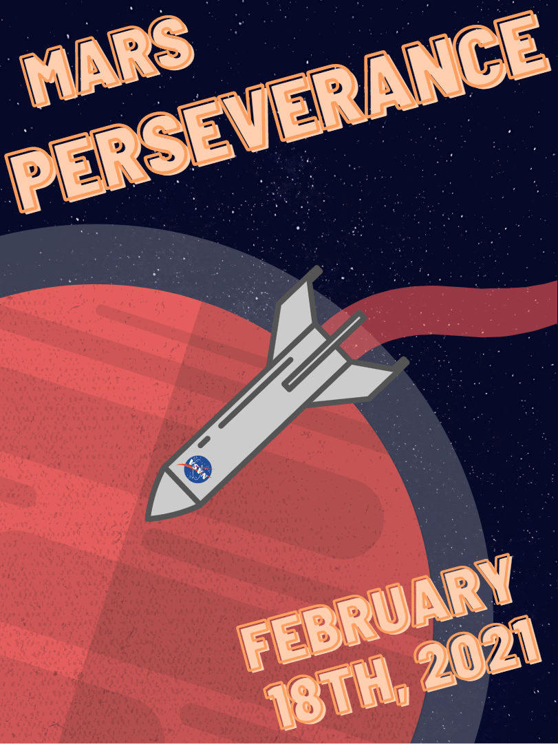
The final product was a poster about the upcoming Mars 2020 rover landing on the planet. I chose this event as I have an interest in space missions, and thought it would be interesting to implement into a poster.
Timeframe
The assigned timeframe for this project was about 2 weeks. The first week was spent coming up with design ideas, making sketches, and applying those ideas into a rough draft. The second week was filled with peer reviews, final touches, and small edits that brought the poster into it's final form.
Challenges
Most posters had much more information relating to their event on it, such as event times, locations, or sign up details.
With my chosen event, those aren't applicable, and therefore my poster had less information. I had to create a poster design that filled the empty space that would have been taken up by that information.
What did I do well?
I believe this poster represents my knowledge about C.R.A.P principals very well. It is the accumulation of two weeks of meticulous work to ensure everything appears as best as it can.
I chose an event I am excited about, which helped make this project more "fun" and less "chore". Having a passion for the work you do is important.
What skills did I learn/practice?
C.R.A.P Design Principals were one of the main focuses when creating this poster. Each element was carefully used throughout the poster.
- Contrast was used with the colors for the text and planet. I wanted the planet to pop out, but also not be a harsh line between it and space. Adding the"atmosphere" helped define the planet and fill the space.
The text colors are warm colors, like with the planet itself, and pop out of the page against the background.
- Repetition was used in the text, using the same test style and colors for both the title and the date.
- Alignment was applied when determining the rotation of the planet and text. During one of my peer reviews, it was recommended that I rotate the planet so the "middle line" was on an angle. It helped make the image more realistic, as the line being perfectly vertical did not fit well.
- Proximity was used when determining placement of the rocket and text. The text at the top was made to fill the space and fit the size.
The rocket in the middle is intended to be the center of attention, and looks close to the viewer. This helps fill the space, and make it clear on what is where.
Potential improvements?
I feel the text at the top is very close to the edges of the poster. Moving it slightly down, or shrinking it slightly, might solve this issue. I want to fill the space, but also not cramp the edges.

Made with
HTML Code Creator